Using Looker to Analyze and Visualise your Customer Concentration
When you’re running a consulting business one of the risks you need to be aware of is customer concentration, when one or two clients grow to become a majority of your billing revenue and go from being your greatest opportunity to the thing that now keeps you awake at night, and not in a good way.
What can initially seem like a good thing can end-up becoming the biggest threat to the survival of your business as they increasingly take-up all of your management and sales time, other clients can end-up being neglected and when that customer moves on, you’ve got a big hole in your billing to suddenly replace and a sales pipeline you’ve now got to rebuild, urgently.
Defined as the percentage of total revenue that your biggest single account contributes, consulting firms typically aim to keep our client concentration below 25%; other businesses in other industries have different guidelines with 10% being suggested by Forbes as a sensible limit.
As a consultancy focusing on the modern data stack we use Looker to monitor and visualize our own customer concentration in the form of two data visualisations; one that shows our customer concentration curve and another that shows the trend of customer concentration for our business over time.
To visualize customer concentration as a time-series chart we first create an explore query that aggregates revenue by month, then pivots the results by client as shown in the explore screenshot below.
To calculate client concentration for each month we then add a Looker table calculation to this query that:
Ranks the revenue amount in each pivot column against the list (pivot_row) of revenue columns for the row
Finds the pivot column with the highest ranked revenue amount (pivot_where) and returns that revenue amount
Divides that highest-ranked revenue amount by the sum of the list of revenue columns to give us the client concentration percentage.
pivot_where(rank(${projects_invoiced.invoice_gbp_revenue_amount},pivot_row(${projects_invoiced.invoice_gbp_revenue_amount}))=1,${projects_invoiced.invoice_gbp_revenue_amount}) / sum(pivot_row(${projects_invoiced.invoice_gbp_revenue_amount}))
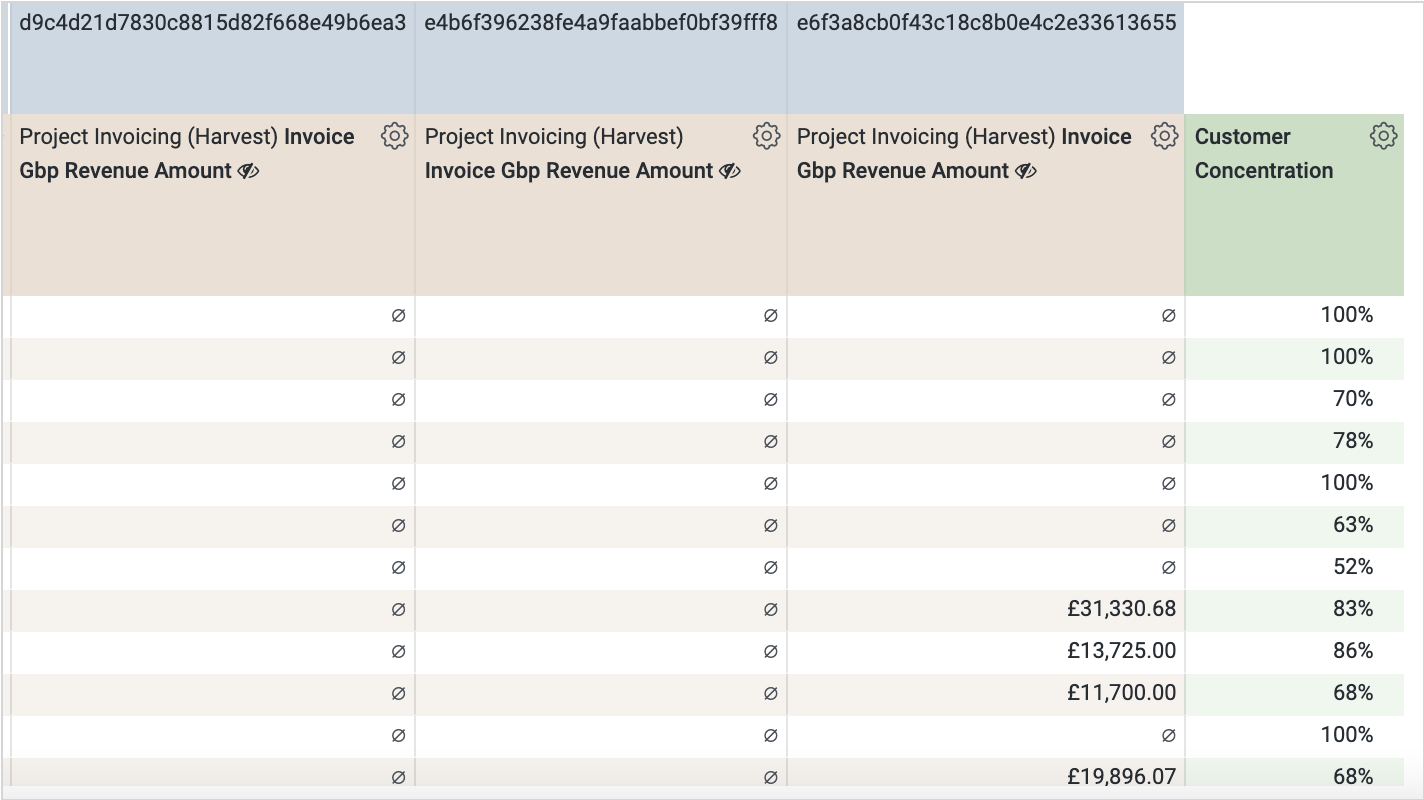
Looker adds this table calculation as a single column to the end of each row, like this:
If you then hide the revenue column and visualize the customer concentration calculation in the form of a line chart, and add range reference lines that highlight the points at which customer concentration becomes a risk, you can visualize this time series calculation as shown in the screenshot below.
For the second chart, creating a customer concentration curve visualisation involves a bit more work as you need to “dimensionalize” the percentage of overall revenue that each client represents and the percentage of all clients that the client represents, and then use those dimensions as the axis of another line chart on which we then plot the count of customers at each axis intersection.
We do this by adding a new derived table-based view to our Looker project that aggregates revenue by client and then calculates the percentage of overall revenue each clients’ aggregated revenue represents.
view: dynamic_company_attributes {derived_table: {sql: with metrics as (SELECTcompanies_dim.company_pk AS company_pk,SUM(projects_invoiced.invoice_revenue_gbp) AS customer_ltvFROM `analytics.companies_dim` AS companies_dimLEFT JOIN `analytics.invoices_fact`AS projects_invoiced ON projects_delivered.timesheet_project_pk = projects_invoiced.timesheet_project_pkWHERE (projects_invoiced.invoice_status ) IN ('Open', 'Paid')and {% condition projects_invoiced.invoice_date %} projects_invoiced.invoice_sent_at_ts {% endcondition %}GROUP BY1),pct_of_revenue as (SELECT*,round((percent_rank() over (order by customer_ltv))*100) as pct_of_revenueFROM metrics)select *from pct_of_revenue;;}dimension: company_pk {primary_key: yeshidden: yestype: stringsql: ${TABLE}.company_pk ;;}dimension: pct_of_revenue {type: tiertiers: [10,20,30,40,50,60,70,80,90,100]style: integergroup_label: " Company Metrics"sql: ${TABLE}.pct_of_revenue ;;}
Note also the templated filter that enables us to dynamically change the period over which the percentage is calculated by reference to whatever time range theprojects_invoiced.invoice_sent_at_ts field is filtered on.
I then join this derived table view back to my main LookML explore, like this:
label: " Business Operations"view_label: " Companies"join: dynamic_company_attributes {view_label: " Companies"sql_on: ${companies_dim.company_pk} = ${dynamic_company_attributes.company_pk} ;;relationship: one_to_onetype: left_outer}
and then create a new explore query that
Returns, as rows, a count of clients broken-down by my new pct_of_revenue tier dimension
Pivots the results of the query by invoice year, so that I can visualize my client concentrate curve by year and see how it has changed over time
Calculates, using another table calculation, the running total percentage of all customers that each row in the revenue percentage tier contains:
running_total((${companies_dim.count} / sum(${companies_dim.count})))
Putting this all together gives us an explore query, results set and line chart visualization as shown the screenshot below, showing each year as a chart series and allowing us to compare our customer concentration curve from year-to-year.
Finally, these two visualisations are then added to a new dashboard to which we then add a time range filter on the invoice date, giving us the ability to calculate client concentration over any arbitrary period of time.
Interested? Find out More
Rittman Analytics is an official Looker Consulting Partner (we’re hiring!) with a team of certified LookML developers who can get you started with Looker, centralise your data sources and enable your end-users and data team with best practices and a modern analytics workflow.
If the idea of analysing and visualising client concentration for your business using Looker sounds interesting to you, or you’re looking for some help and assistance building-out your new customer data analytics platform on a modern, flexible and modular data stack, contact us now to organize a 100%-free, no-obligation call — we’d love to hear from you!


