How Rittman Analytics Does Financial Analytics using Looker, Fivetran and Google BigQuery
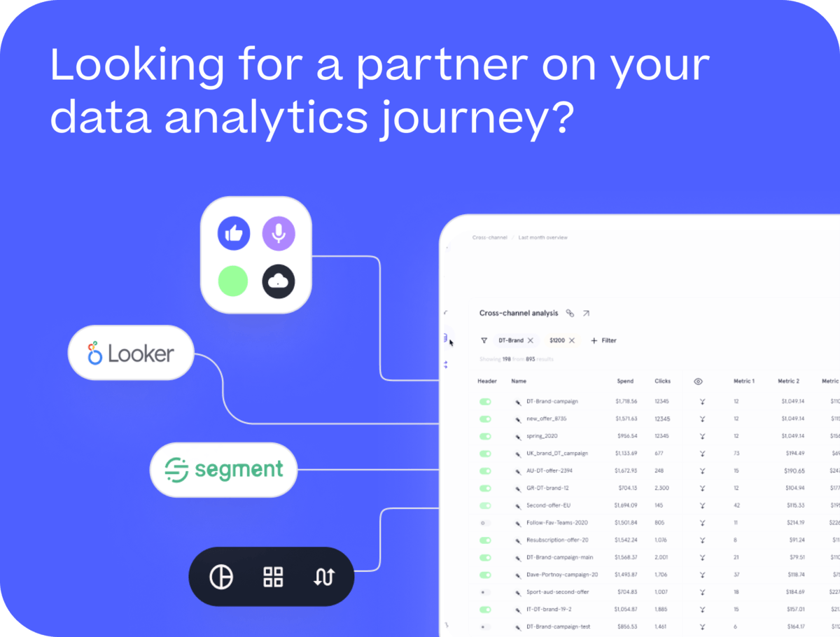
As you’d expect from a data analytics consultancy that runs its business on Google Cloud, Google BigQuery and Looker, we use these services to provide the financial reports and dashboards our finance team needs to understand the trends and direction in our revenue, costs and profitability.
In this blog I’ll explain how we source and integrate the data we need from Xero, our accounting system and other finance sources, how we’ve built a Looker dashboard for financial analytics and how we’re opening-up this trusted finance data more widely in the company via Google Sheets integration and Looker’s new Conversational Analytics feature.
Sourcing and Transforming our Xero Finance Data
Using Fivetran we extract our accounting data from Xero into Google BigQuery and then transform it, along with timesheet and invoice data and our budgets held in Google Sheets into a finance data mart within our corporate data warehouse.
A key part of the logic for these transformations is an adapted version of the Fivetran Xero dbt package that generates a profit_and_loss_report_fact table that is the source of data for most of our finance reporting each month.
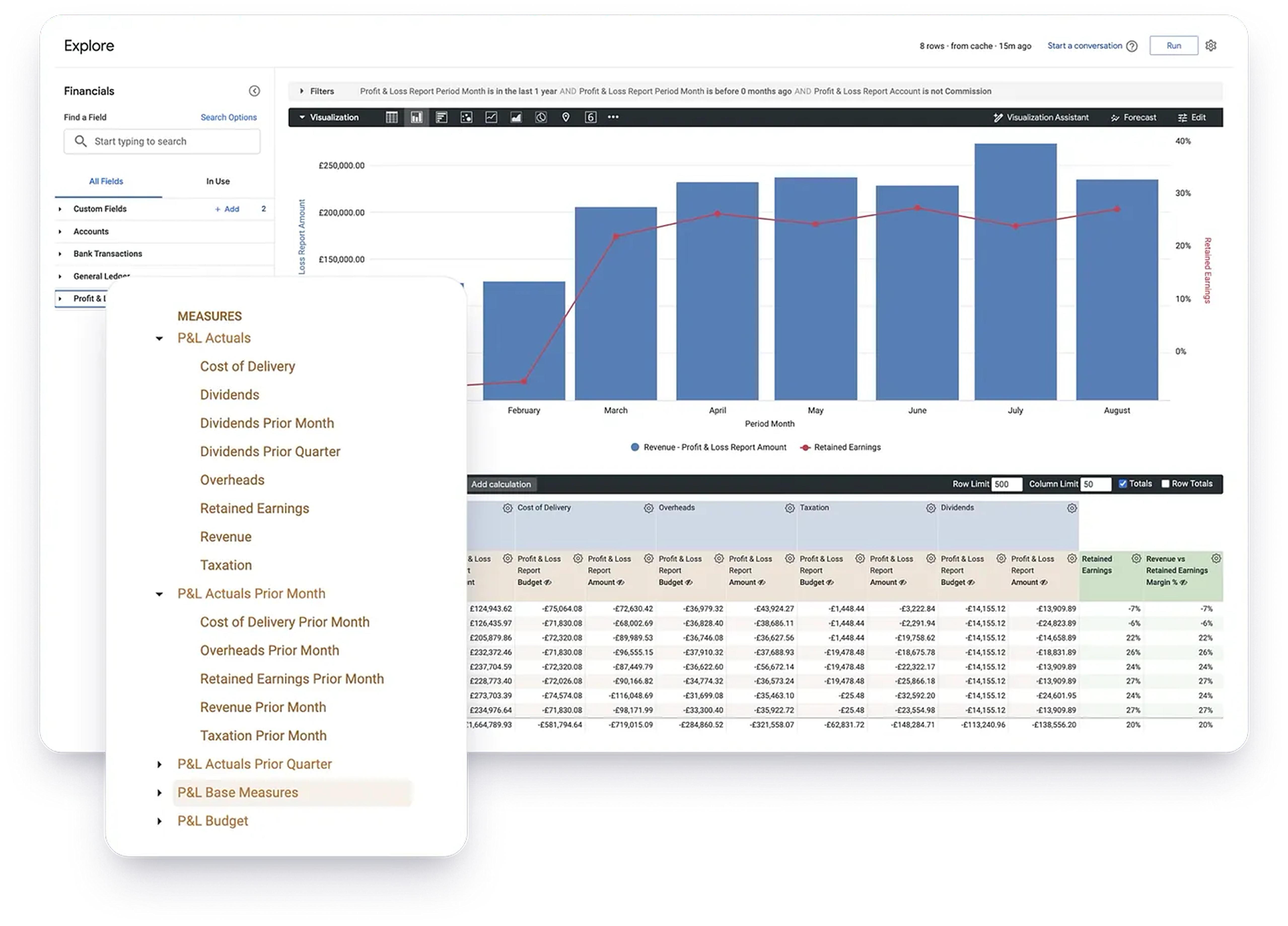
Looking at the contents of this dbt model and table you can see that while its structure suits the needs of a P&L report, if we wanted to create a calculation where, for example, gross_profit = Revenue — Cost of Delivery we’d have to use quite complicated SQL or Looker table calculations in-order to turn this net_amount measure into measures useful for reporting or calculations.
So to make this table’s output easier to work with in Looker, we then use LookML measure filters to create derivations of this amount measure for top-level P&L category-level measures such as Revenue, Cost of Delivery, Overheads and Taxation.
measure: revenue {
 group_label: "P&L Actuals"
 type: sum
 description: "Sales revenue from consulting projects and other services"
 value_format_name: gbp
 sql: ${TABLE}.amount;;
 filters: [account_report_category: "Revenue"]
 }
In addition we also then use the new period-over-period measure type in LookML to create comparison measures for month-ago, quarter-ago and so on.
measure: revenue_prior_month {
 group_label: "P&L Actuals Prior Month"
 type: period_over_period
 label: "Revenue Prior Month"
 description: "Sales Revenue prior month (i.e. previous month)"
 based_on: revenue
 based_on_time: period_month
 period: month
 value_format_name: gbp
 sql: ${amount_base} ;;
 }
Together with our budget data we now have a Looker explore that can be used to provide reporting on the financial results of the company.
In the screenshot below the P&L Base Measures folder contains the base-level Amount and Budget measures we’ll need for creating our P&L report later on, and the derived Revenue and other measures will be used when reporting on revenue trends or for comparison or calculations we need to use elsewhere in our dashboard.
Our Financial Analytics Looker Dashboard
The screenshot below shows (with mocked-up numbers) the Financial Analytics dashboard we’re currently using at Rittman Analytics. The key visualisations and reports are highlighted and explained after the screenshot.
1. Headline financial KPIs
These are the top-level set of finance KPIs that communicate our YTD performance — “are we currently on-track to hit our revenue number, and are we doing so with a decent net margin?” and are calculated using the Revenue, Cost of Delivery and other measures we derived from the net_amount P&L report measure previously, with additional calculations in the explore queries to calculate % to target as provided by our budgets data source.
2. Variance against budget for our top-level P&L report categories
This table-format visualization provides actuals against budget for each top-level (Revenue, Cost of Deliveryetc) P&L report category with the % variance against budget that each actual number represents —answering questions such as “are our costs increasingly linearly with revenue, at a slower rate than revenue (which is good) or at a faster rate (which is bad)?”
3. Profit & Loss Report
This is the report within the dashboard and tells us, by month and YTD, what our Revenue, direct (Cost of Delivery) and indirect (Overheads) costs were along with our provision for corporation tax ( Taxation), shareholder distributions ( Dividends) and our retained earnings that were left after all these costs (Total in the report).
P&L reports (or income statements in the US and some other countries) have a particular finance report layout that accountants expect to see, and to create ours we use:
- The Report Table custom visualization, which provides additional controls that let’s us specify the column for which we create subtotals in the report, how we display negative values and so on
- a Pivot of the month dimension in the report together with Row Totals and Totals, in order to give us one column per month with YTD and retained earnings totals at the bottom of each month column
- Sorting of the
account_report_categoryand other P&L account dimensions by corresponding_orderhidden dimensions, so that our report categories such as Revenue, Cost of Delivery, Overheads, and Retained Earnings always appear in the correct order in the report.
dimension: account_report_category {
 label: "Account Category"

 hidden: no
 order_by_field: account_report_category_order
 type: string
 description: "Top-level P&L account grouping; Revenue, Cost of Delivery, Overheads, Dividends and Retained Earnings"
 sql: ${TABLE}.account_report_category ;;
 }
4. Revenue Pipeline & Cumulative Revenue YTD
Apart from the detailed P&L report, we also include a few summary visualisations that help us understand trends in our finance numbers.
For example, the Revenue Pipeline visualization (as explained in more detail in this earlier blog) tells me how much of a backlog of agreed and in-negotiation project we had at the end of each month, a good indication of whether we should start hiring or whether in-fact we need to step-up our sales and marketing activity.
The cumulative revenue visualization plots this year’s revenue growth curve against previous years, showing me visually whether we’re having a good or bad year compared to the last five.
5. Monthly Average, Min and Max Cash Balance
“Revenue is vanity but cash is king” goes the old saying in business, and its easy to think that billing = cash in bank whereas it’s often 30, 60 or more days between completing a piece of client work and getting money in the bank, and all the while your team need paying in the meantime.
By monitoring the average, highest and lowest balance in our company bank account each month and keeping an eye on when the average might be trending down rather than up, and by understanding the working capital we need to make sure is available in our account each month as bills get paid and money comes in, we can avoid the awkward situation where everyone’s been busy but there’s no money to pay the quarterly VAT bill.
6. Forecast Revenue for the next six months
Predicting what our revenue will look-like over the coming months is important as we’ll need to base decisions over hiring, expansion or cutting costs over those numbers. Contracts running over six or twelve months make this task easier but the nature of consulting work is shorter engagements that may not even be in our pipeline at this point.
We covered the forecasting ability within Looker on the blog a few years ago and while this type of forecasting approach is never going to know about a big contract that ends this month or new ones just about to be signed, it takes a statistical approach that isn’t too far-off the mark as long as you provide it with enough historical data and enable the seasonality feature if your revenue is, well seasonal.
For example, the forecast in the screenshot above predicts a fairly-spiky growth in sales when we include two years worth of actual data and ask Looker to forecast forward a further six months, whereas the screenshot below takes three years of data and factors-in seasonality.
Which type of forecast is correct for your business will come down to how much your past performance is an indicator of your future, whether your sales are seasonal and so on. In-practice we combine this type of forecast with our schedule of future invoicing from booked work so at least the immediate future is more grounded in facts, not statistical forecasting.
Google Sheets, Conversational Analytics and Other Routes to Consuming Looker Financials Data
The big advantage of putting all your financial analytics data sources and reporting into Looker is the single version of the truth it gives your team; revenue is defined once and consistently across your organisation and you have point-and-click reporting tools that make it easy to find and share insights from your data.
Looker data as an input into your spreadsheet models
But in some cases you’ll have a need to combine this trusted Looker data with spreadsheet models business users’ own and control, and so Connected Sheets for Looker brings that data, refreshable on-demand or scheduled is a great way to ensure that at least the starting data in a user’s spreadsheet model is correct.
Providing a Conversational UI for your trusted financial data
The appeal of Looker’s new Conversational Analytics feature is that it opens-up the trusted data in your Looker semantic model to users who don’t have the time or capability to use Looker’s point-and-click data analysis tools. The challenge though is providing Conversation Analytics with sufficient context on your business and its way of reporting numbers so that it doesn’t just make this up for itself and provide the wrong results back to the user.
In my previous article on this feature I explained how I used a LookML export of a dashboard to provide this much-needed context, and for our financials data the approach I’ve used is the same:
- Create a LookML export of the key dashboard for a dataset, in our case the Financial Analytics dashboard we’ve just gone through, and pass it to Gemini with a prompt to turn it into instructions for a Conversational Analytics Agent
- Review those instructions and fine-tune them with details about the currency to report in, output formats and so on
- Paste those instructions into the definition of your Conversational Analytics Agent, where you’ll also select the dataset that the agent will use and the persona it will adopt, and
- Your responses from the Conversational Analytics agent should then be informed by the knowledge and calculation rules that were derived from the LookML version of your financial analytics dashboard
Interested? Find Out More!
Rittman Analytics is a boutique data analytics consultancy that helps ambitious, digital-native businesses scale-up their approach to data, analytics and generative AI.
We’re authorised delivery partners for Google Cloud along with Oracle, Segment, Cube, Dagster, Preset, dbt Labs and Fivetran and are experts at helping you design an analytics solution that’s right for your organisation’s needs, use-cases and budget and working with you and your data team to successfully implement it.
If you’re looking for some help and assistance with your AI initiative or would just like to talk shop and share ideas and thoughts on what’s going on in your organisation and the wider data analytics world, contact us now to organise a 100%-free, no-obligation call — we’d love to hear from you!
Recommended Posts
How Rittman Analytics Does Financial Analytics using Looker, Fivetran and Google BigQuery
Opinionated, AI-Enabled & Modern: The Story Behind Rittman Analytics’ New Website
One Person Many Roles: Designing a Unified Person Dimension in Google BigQuery