Automating Insights and Dashboard Report-Level Narratives using Vertex AI Gemini 1.5-Flash, Looker Studio and Google BigQuery BQML
Extracting and collecting all the data required for the various KPIs in the reports
Prepping and validating that data so that it’s ready for reporting and structured for analysis
Assembling and publishing the reports and sending them out, initially at first to a departmental analyst
The analyst then reviewing those reports and comparing this month’s results against previous months, sometimes bringing-in other data to try and understand what’s happened
Turning that analysis into digestable report-level narratives that get added to the reports before they are sent to senior management
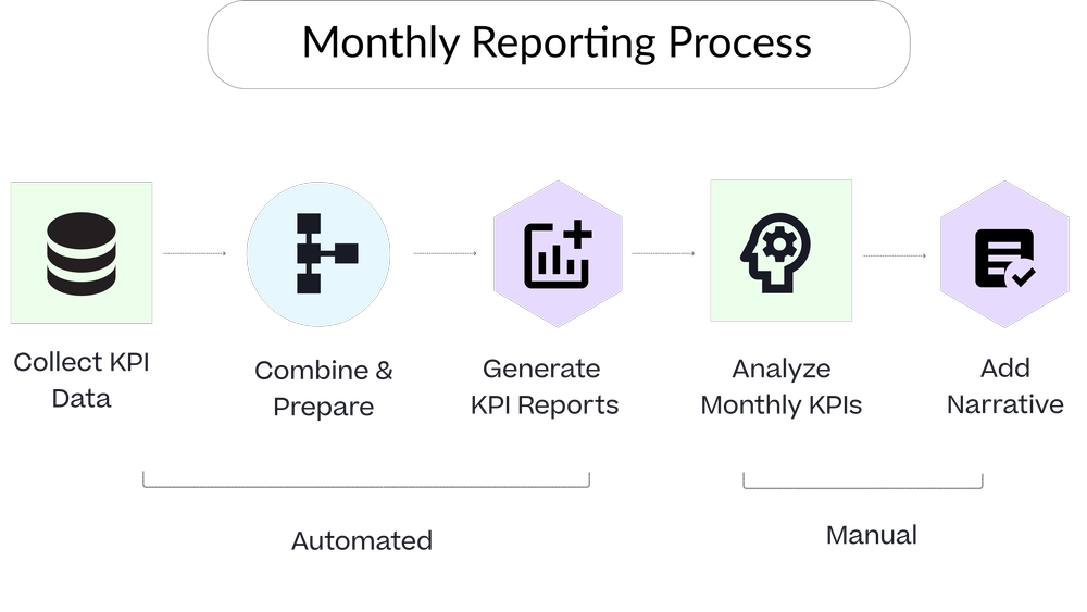
Data pipeline tools such as Fivetran and dbt along with self-service BI tools such as Looker, Tableau and Looker Studio have done a pretty-good job of automating the first three steps in this process, but the bottleneck still comes from the analysis and interpretation steps that are typically still done manually.
So how can GenAI in the form of Google Cloud Vertex AI’s Gemini Large Language Model (LLM), together with Looker Studio and Google BigQuery BQML help automate the insight and analysis parts of the reporting process, potentially decreasing the time it takes an organization to understand and react to changes in their business environment and removing those bottlenecks in the reporting process?
Example Scenario : An AI-Powered KPI Dashboard for Rittman Analytics
To see how this might work, I’d like to create a report for senior management at Rittman Analytics that includes KPIs from across the business, to provide a high-level summary of last month’s overall performance along with more details on our sales, marketing and project delivery performance.
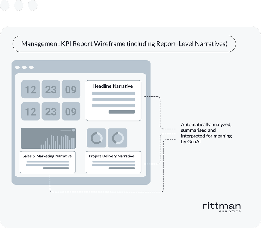
To help whoever’s reading the report quickly understand the implications and conclusions to be drawn from those KPIs, we’d also like to accompany each KPI visualization with a narrative that considers:
How those KPI values compare against target, as well as against the previous month, quarter-to-date and compared against the same time last year
Performance against other, related KPIs not necessarily displayed in the report but critical to understanding these top-level ones
Trends and correlations between changes in one KPI and others that may depend or are influenced by it, for example leadgen and sales activity KPIs that if underperforming against target will have an impact on revenue down the line
The Looker GenAI Dashboard Summarization plugin that we covered on the blog earlier in the year only actually considers data you can see on-screen when a summary is requested by the user; this is useful if you have applied lots of filters to a dashboard and want the LLM to summarise what’s being shown to you but it can’t consider how those values compare to past trends or could be explained by other, related KPI changes.
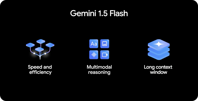
In-contrast the dashboard shown in the screenshot below, created using Looker Studio Pro (integrated with Looker’s LookML semantic layer) and making use of Gemini 1.5-Flash, a newly-available large language model (LLM) available for use with Google BigQuery through its Vertex AI integration, includes narratives at the individual report and visualization level that consider all of the KPIs stored in our data warehouse for this month and for 36 months of history.
Part of the Gemini 1.5 Pro family of LLMs, Gemini 1.5 Flash is particularly well-suited to the fast analysis of financial tabular data and features a breakthrough long context window of up to 1m tokens, giving us the ability to send large amounts of historical KPI data to Vertex AI to inform the narratives we attach to our report visualizations.
Creating the KPI History Table
To create the analysis and narratives for our report we start by creating a table for our data warehouse that aggregates all relevant metrics by month and adds calculated fields for the most useful ratios and percentages we use in the business day-to-day.
CREATE TABLE `ra-development.analytics.monthly_performance_fact`
(
  date_spine_dim_date_month STRING,
  total_new_data_centralization_sales_leads INT64,
  total_new_marketing_analytics_sales_leads INT64,
  total_new_cdp_nsales_leads INT64,
  total_other_new_sales_leads INT64,
  total_won_oppportunities INT64,
  total_lost_oppportunities INT64,
  ...
  pct_cost_of_delivery FLOAT64,
  pct_cost_of_overheads FLOAT64,
  pct_won_deal_amount_to_target FLOAT64,
  pct_new_sales_leads_to_target FLOAT64
);
This table, or subsets of it, is what our Vertex AI model will have access to in order to compare the current month’s KPI performance against history and the other KPIs across the business that may have influenced its performance.
We populate the table using a set of dbt transformations, or you can use Dataform, Matillion or one of the other data transformations tools out there.
Formatting the KPI History table as a JSON String
As we want to bundle-up this set of historical KPI values into a format that we can send as part of an LLM prompt, we do this by first turning each row of data into an array using Google BigQuery SQL’s STRUCT() function and then use the TO_JSON_STRING function to turn that array into a JSON-formatted string.
Then we use the STRING_AGG function to concatenate all of the historical rows of KPI data into one long string value, taking-care to order the contents of the string so that the most-recent month’s worth of data is at the start of the string text and ignoring the current, incomplete month.
WITH
  monthly_performance_data AS (
  SELECT
    CONCAT('[',STRING_AGG(TO_JSON_STRING(STRUCT(date_spine_dim_date_month,
            total_new_data_centralization_sales_leads,
            total_new_marketing_analytics_sales_leads,
            total_new_cdp_nsales_leads,
            total_other_new_sales_leads,
            total_won_oppportunities,
            total_lost_oppportunities,
            total_won_opportunity_amount_gbp,
            total_lost_opportunity_amount_gbp,
            total_weighted_opportunity_pipeline_amount_gbp,
            total_opportunities,
            total_opportunity_amount_gbp,
            ...
            pct_revenue_to_target,
            pct_profit_to_target,
            pct_cost_of_delivery,
            pct_cost_of_overheads,
            pct_new_sales_leads_to_target) )
      ORDER BY
        date_spine_dim_date_month DESC),']') AS monthly_metrics
  FROM
    {{ ref('wh_monthly_performance_fact')}}
  WHERE
    CONCAT(date_spine_dim_date_month,'-01') != CAST(DATE_TRUNC(CURRENT_DATE,MONTH) AS STRING)
  ),
Including all of the KPIs from the KPI summary table in this JSON string makes sense for the report narrative we want to accompany the top-level KPIs, but for those reports that focus just on a subset of the business or a department such as sales and marketing, we create JSON strings of KPI values that are relevant to them.
Creating the Vertex AI Gemini 1.5 Flash LLM model in Google BigQuery
To register the LLM that we’ll send our KPI data to in order to generate the report narrative we followed these steps:
Create a cloud resource connection and assign the correct IAM permissions to it, as described in this part of the Google Cloud docs
Create a Gemini 1.5 Flash LLM model in your BigQuery project, altering the name of the project and connection as appropriate:
CREATE OR REPLACE MODEL `analytics_ai.gemini_1_5_flash`
REMOTE WITH CONNECTION `projects/ra-development/locations/europe-west2/connections/ra-vertex-ai`
OPTIONS (endpoint = 'gemini-1.5-flash')
Sending a Prompt and our Metrics JSON String to the LLM
Generating a narrative for one of our reports using the model we’ve just registered can also be done in BigQuery BQML SQL, using the GENERATE_TEXT function we covered in another blog a few months ago, “Automate your Contacts List Segmentation using Google BigQuery, Vertex AI and the ML.GENERATE_TEXT function”.
overall_summary AS (
  SELECT
    DATE_TRUNC(current_date,MONTH) AS analysis_month,
    ml_generate_text_llm_result AS overall_summary
  FROM
    ML.GENERATE_TEXT( MODEL `analytics_ai.gemini_1_5_flash`,
      (
      SELECT
        CONCAT('this data is for Rittman Analytics, a data analytics consulting
 services company. Please give me a summary of performance in a
 multi-paragraphs format suitable for inclusion as narrative in a
 dashboard and with no header or greeting for the latest month in
 this dataset with the CEO and SMT as the audience,
 comparing against the previous month and current quarter-to-date
 to previous quarter-to-date and current month to same month last year,
 highlighting the most significant changes and trends in data and
 analyzing how the impact of changes in one metric are affecting others
 either within that month or over time.: ',mm.monthly_metrics) AS prompt
      FROM
        monthly_performance_data mm),
      STRUCT( 0.2 AS temperature,
        1024 AS max_output_tokens,
        TRUE AS flatten_json_output))),
These summary narratives are also created, with just subsets of the KPI history values, for the sales and marketing report and the project delivery report, then combined together to populate a row in a table that the Looker Studio report will then use as the data source for the various narrative sections in the report.
SELECT
  overall_summary.analysis_month,
  overall_summary.overall_summary,
  sales_marketing_summary.sales_marketing_summary,
  delivery_summary.delivery_summary,
  finance_summary.finance_summary
FROM
  overall_summary
JOIN
  sales_marketing_summary
ON
  overall_summary.analysis_month = sales_marketing_summary.analysis_month
JOIN
  delivery_summary
ON
  overall_summary.analysis_month = delivery_summary.analysis_month
JOIN
  finance_summary
ON
  overall_summary.analysis_month = finance_summary.analysis_month
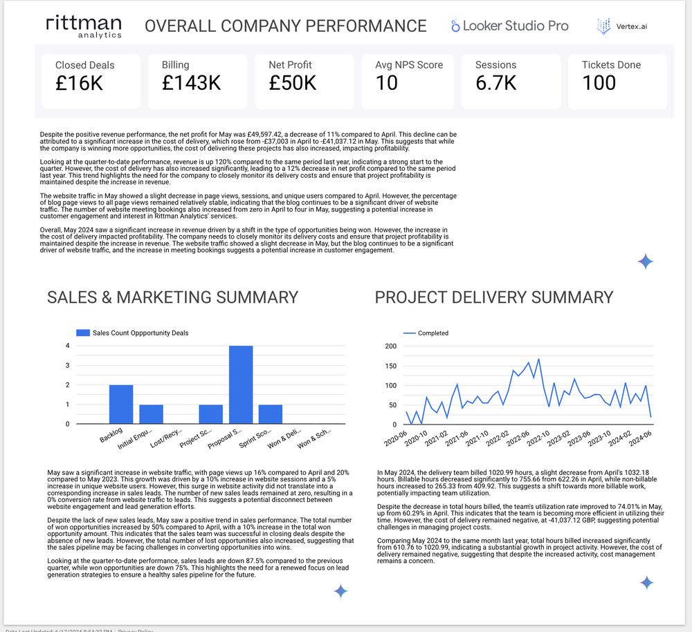
Viewing the Analysis and Narrative for the Company-Wide Summary
If we look then at one of the narratives and consider the analysis used by the model to come to its conclusions, you can clearly see that historical and related data beyond just that displayed in the report was used in that analysis.
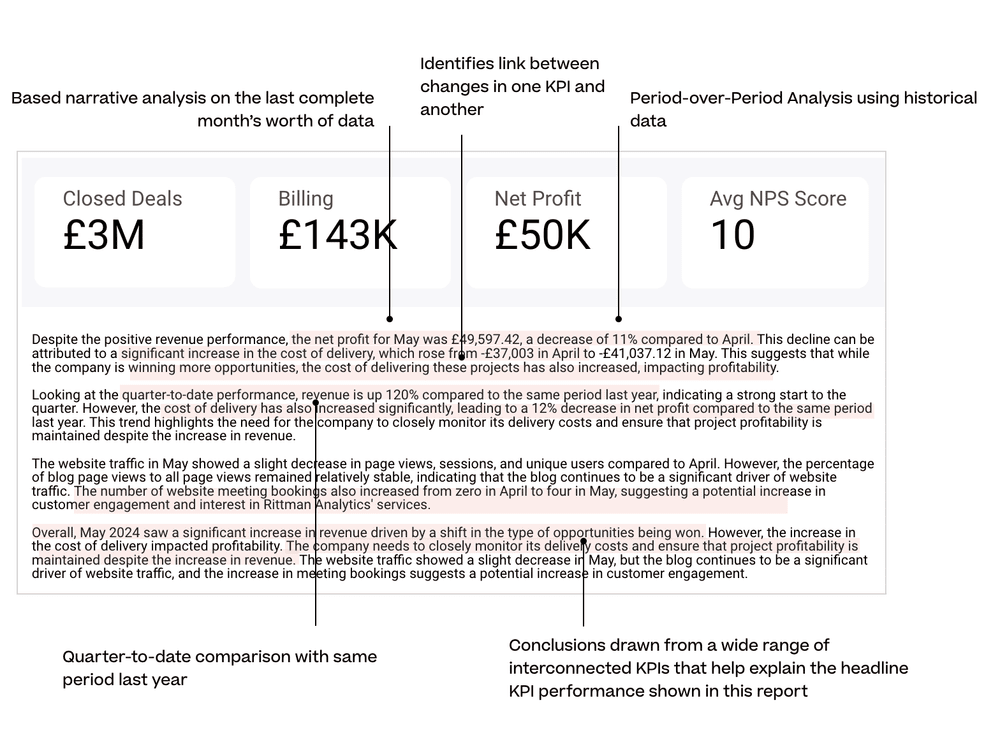
May, the latest month for which we have a complete set of data, is compared against the prior month when analyzing revenue performance and later-on is compared quarter-to-date vs. same period last year.
This increase in revenue is, however, accompanied by an increase in the cost of delivery — the curse of all consulting businesses — and the AI model does well to connect these two KPIs together and remind us not to go out and buy Apple Vision Pro headsets for all of the team, for now at least.
For more examples of what we’re currently doing with GenAI within Rittman Analytics check out our other blogs below:
or take a look at our Generative AI services page and our fixed-price, Jumpstart GenAI and Looker consulting package that can deliver these types of AI-powered dashboards for your organization, now!
INTERESTED? FIND OUT MORE!
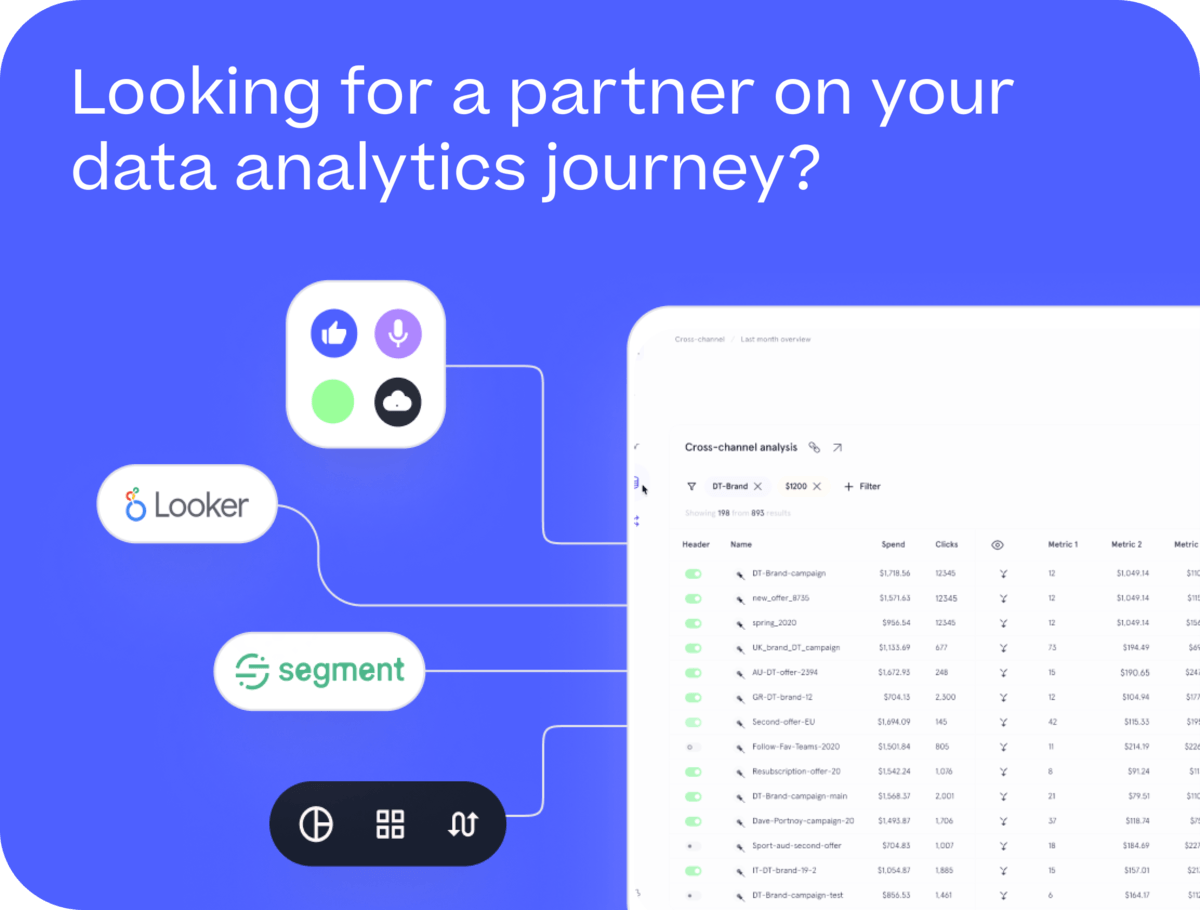
Rittman Analytics is a boutique data analytics consultancy that helps ambitious, digital-native businesses scale-up their approach to data, analytics and generative AI.
We’re authorised delivery partners for Google Cloud along with Oracle, Segment, Cube, Dagster, Preset, dbt Labs and Fivetran and are experts at helping you design an analytics solution that’s right for your organisation’s needs, use-cases and budget and working with you and your data team to successfully implement it.
If you’re looking for some help and assistance with your AI initiative or would just like to talk shop and share ideas and thoughts on what’s going on in your organisation and the wider data analytics world, contact us now to organise a 100%-free, no-obligation call — we’d love to hear from you!
Recommended Posts
One Person Many Roles: Designing a Unified Person Dimension in Google BigQuery
Why We’ve Tried to Replace Data Analytics Developers Every Decade Since 1974
How Rittman Analytics uses AI-Augmented Project Delivery to Provide Value to Users, Faster