RFM Analysis and Customer Segmentation — Rittman Analytics
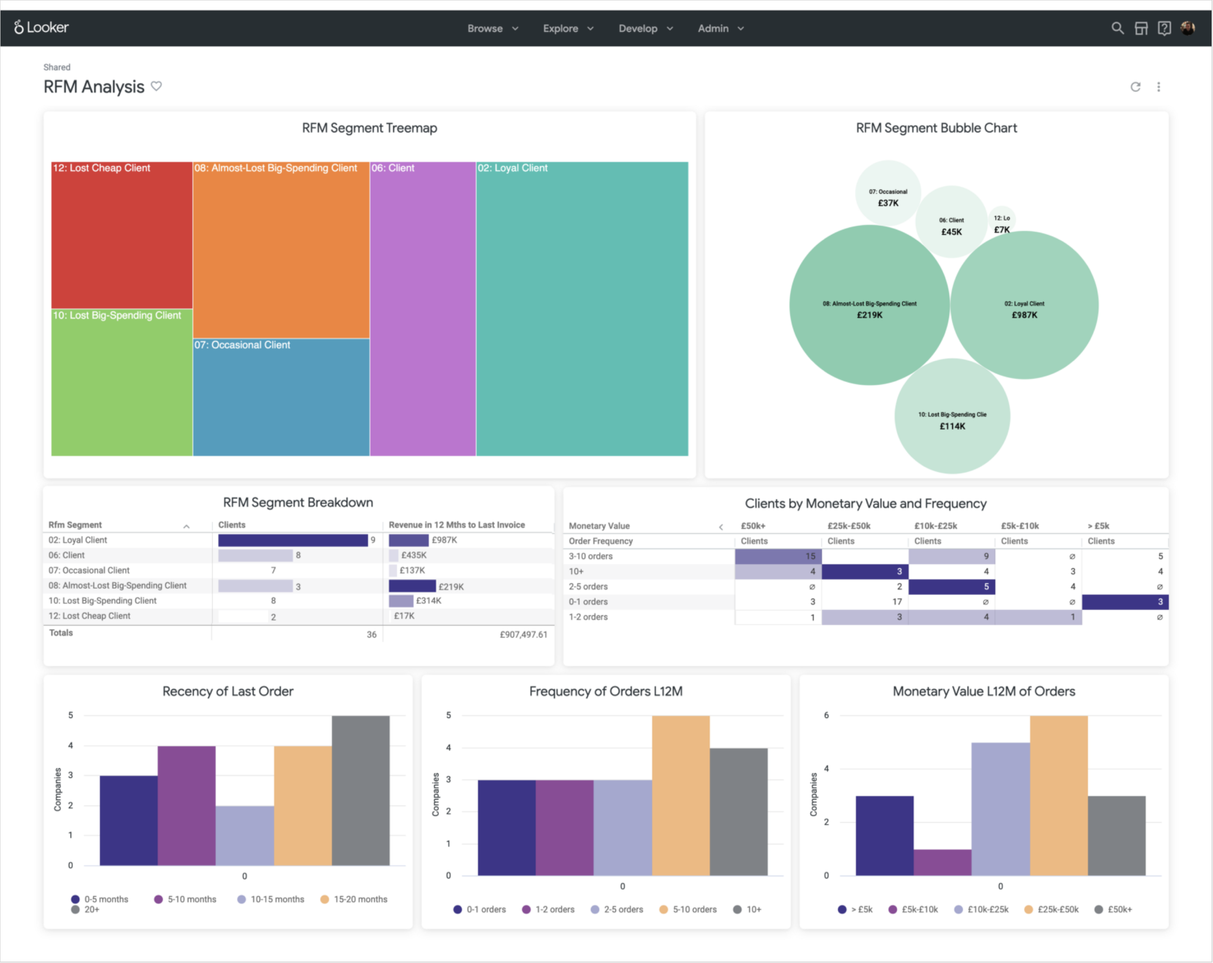
One of the simplest but most actionable ways that you can analyse your customer base is to build an RFM (Recency, Frequency, Monetary Value) model and make that analysis actionable using a Looker dashboard, such as the one below based on the RFM dashboard we use for our consulting business.
rfm_dashboard.png
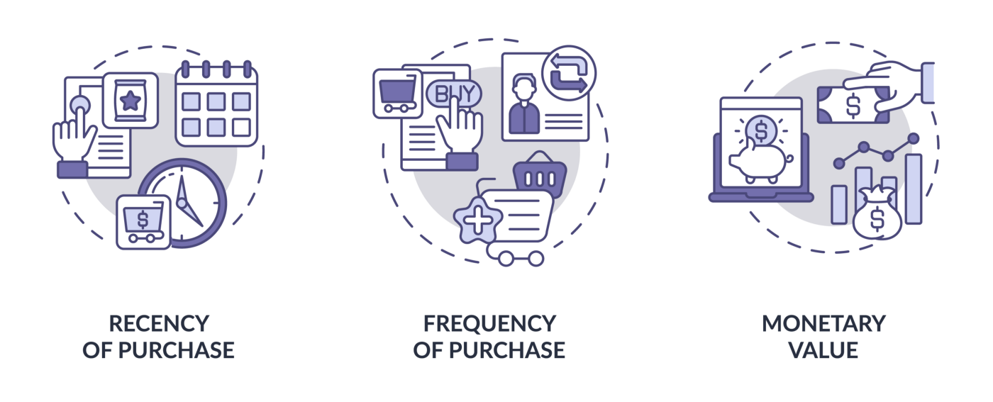
Most commonly used by our clients in the retail, marketplace, professional services and eCommerce businesses, RFM models score your customer base by three factors:
1_OhV1O0SLjibJk6EvwkVg5g.png
-
Recency: How recently a customer has made a purchase, either in months, days or weeks depending on your market’s typical purchase cycle
-
Frequency: How often a customer makes a purchase, typically measured over the twelve months leading up to each customer’s last purchase
-
Monetary Value: How much money a customer spends on purchase, either in-total or on-average over the same twelve month period
By taking the values for each customer, bucketing them to produce a score from 1 (lowest) to 5 (highest) and then concatenating all three scores together you get an easy way to divide-up your customers into segments (or “RFM cells”; high-spending new purchasers (514, 5 for recency, 1 for frequency and 4 for monetary value), almost-lost but previously loyal customers (153, 1 for recency, 5 for frequency and 3 for monetary value) and so on.
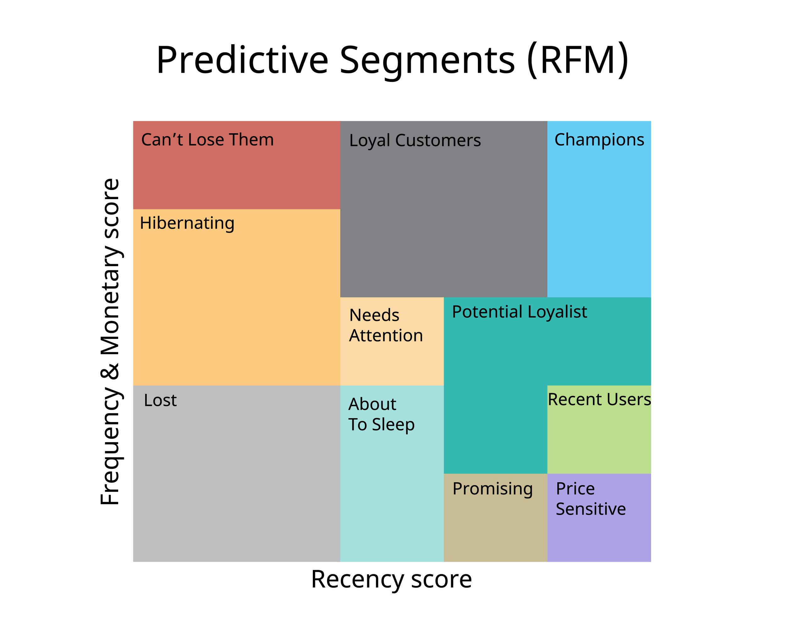
One of the most popular ways to visualize your customer RFM segments is by using a grid such as the one below, with each segment labelled and sized proportionate to the volume of customers each contains.
rfm_grid.png
RFM analysis is particularly useful for sales and customer teams needing to focus their limited time and money on those customers for whom a change in behavior — from lapsed to active, or first-time to repeat shopper for example — would have the most impact on your bottom line.
For example, by focusing retention efforts on customers who used to be frequent, loyal and high-value purchasers (RFM segment 355) the revenue upside is obviously much greater than if they managed to retain customers who were previously infrequent low-value purchasers (RFM segment 132).
Similarly, there’s little point in incentivising customers who are already your most loyal, frequent and high-spending customers (RFM segment 555) when spending those incentives on customers who’ve just made their first purchase and have the potential to also become loyal and valuable repeat customers (RFM segment 514, for example)
Building an RFM model is often one of the first projects our clients’ data teams ask us to help deliver as the concept is straightforward, the data required has usually just been centralized and the output is immediately actionable by customer and marketing teams keen to focus their time on customer activity that has the greatest potential to retain or increase revenue.
We’ve created an RFM model using the project timesheets and invoicing data we centralise in our Google BigQuery data warehouse and used it to create the RFM analysis dashboard shown in the screenshot at the start of this blog; in the rest of this blog I’ll walk through how we build the model using dbt and LookML and used the visualization features in Looker to help analyze and make the data actionable.
For the purposes of the RFM model we created for our consulting business, we defined our Recency, Frequency and Monetary Value measures as:
-
Recency: the number of months since the last invoice raised for a customer
-
Frequency : the number of invoices raised for the customer in the 12 months leading-up to their last invoice
-
Monetary Value : the total value of invoices raised for the customer over the 12 months leading-up to their last invoice
We already had timesheets, invoice and client spend data available in the cloud data warehouse we build using dbt and our RA Warehouse dbt packagethe new release of which I covered in our blog last year.
The invoices_fact table in the warehouse contained invoice_created_at_ts, invoice_amount and other columns sourced from Harvest together with first_invoice_month_ts and months_since_first_invoice columns created using SQL window (analytic) functions that we used as part of retention and customer lifetime value calculations.
To enable us to calculate each clients’ recency score we added a column that calculated the number of months each invoice’s creation date was from today, using date functions from the dbt_utils dbt package so that our code stayed portable across BigQuery, Redshift, Snowflake and the other cloud data warehouse platforms our clients work with.
{{ dbt_utils.datediff('invoice_created_at_ts','current_timestamp','MONTH') }} as invoice_months_before_now,
For the frequency and monetary value RFM scores we needed two more fact table columns that gave us the date of the very last invoice for that client, along with another that told us how many months before that last invoice this particular invoice was created:
{{ dbt_utils.date_trunc('MONTH','MAX(date(invoice_created_at_ts))OVER (partition by c.company_pkRANGE BETWEEN UNBOUNDED PRECEDING AND UNBOUNDED FOLLOWING)') }} last_invoice_month,{{ dbt_utils.datediff('invoice_sent_at_ts','MAX(DATE(invoice_sent_at_ts))OVER (PARTITION BY c.company_pkRANGE BETWEEN UNBOUNDED PRECEDING AND UNBOUNDED FOLLOWING)','MONTH') }} as months_before_last_invoice,
Moving over to our LookML project in Looker, I could then define a LookML dimension using the months_before_last_invoice column along with a LookML measure that calculated the minimum for that measure to give us the invoice recency for each client.
dimension: invoice_months_before_now {type: numbersql: ${TABLE}.invoice_months_before_now ;;}measure: min_invoice_months_before_now {type: minsql: ${invoice_months_before_now} ;;}
To count the number of invoices in the 12 months leading-up to their last invoice I created a dimension that filtered on the months_before_last_invoice column and then used it to filter the invoice count, and also the revenue measures:
dimension: is_invoice_in_clients_last_12m {type: yesnosql: ${months_before_last_invoice} < 12 ;;}measure: total_invoice_count_in_clients_last_12m {type: count_distinctsql: ${TABLE}.invoice_pk ;;filters: [is_invoice_in_clients_last_12m: "Yes"]}measure: total_invoice_gbp_amount_in_clients_last_12m {value_format_name: gbptype: sumsql: ${TABLE}.invoice_local_total_revenue_amount ;;filters: [is_invoice_in_clients_last_12m: "Yes"]}
Each client then needs to be scored from 1 to 5 on each of their RFM factors, scoring clients whose last invoice was in the current month as 5, in the last two or three months as a 4 and so on until clients with the highest number of months since their last invoice are scored as a five.
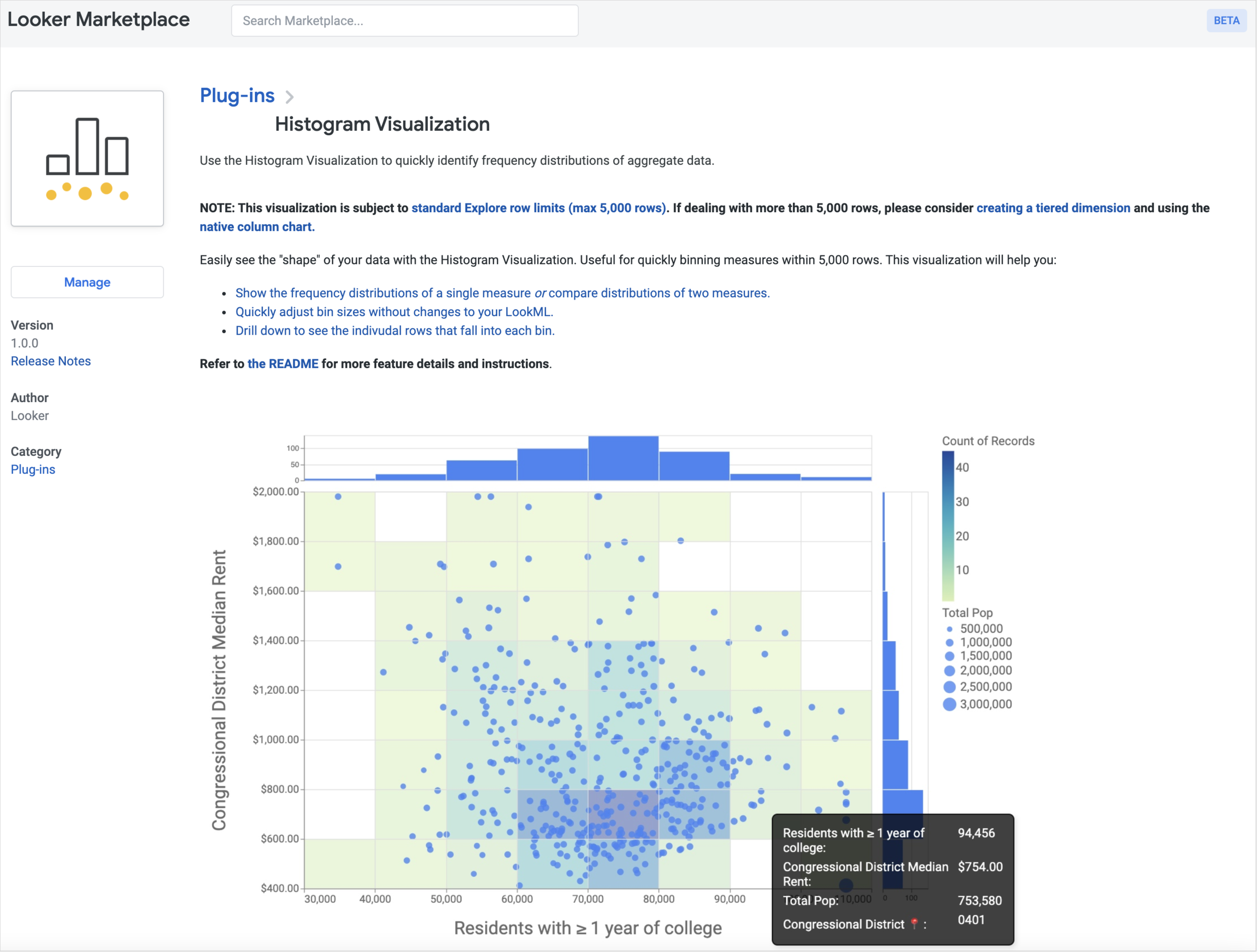
Looker has several methods by which you can bucket a column’s values in LookML but these all rely on you already knowing what bucket definitions are appropriate for your data; as we didn’t know the distribution of our data we installed the Histogram Visualization plug-in from the Looker Marketplace that lets us discover these boundaries interactively.
marketplace.png
Using this visualization we entered a range of values and settings for the different bucket bin definitions, starting with the default 3 bins for the minimum months since last invoice measure used for the recency score.
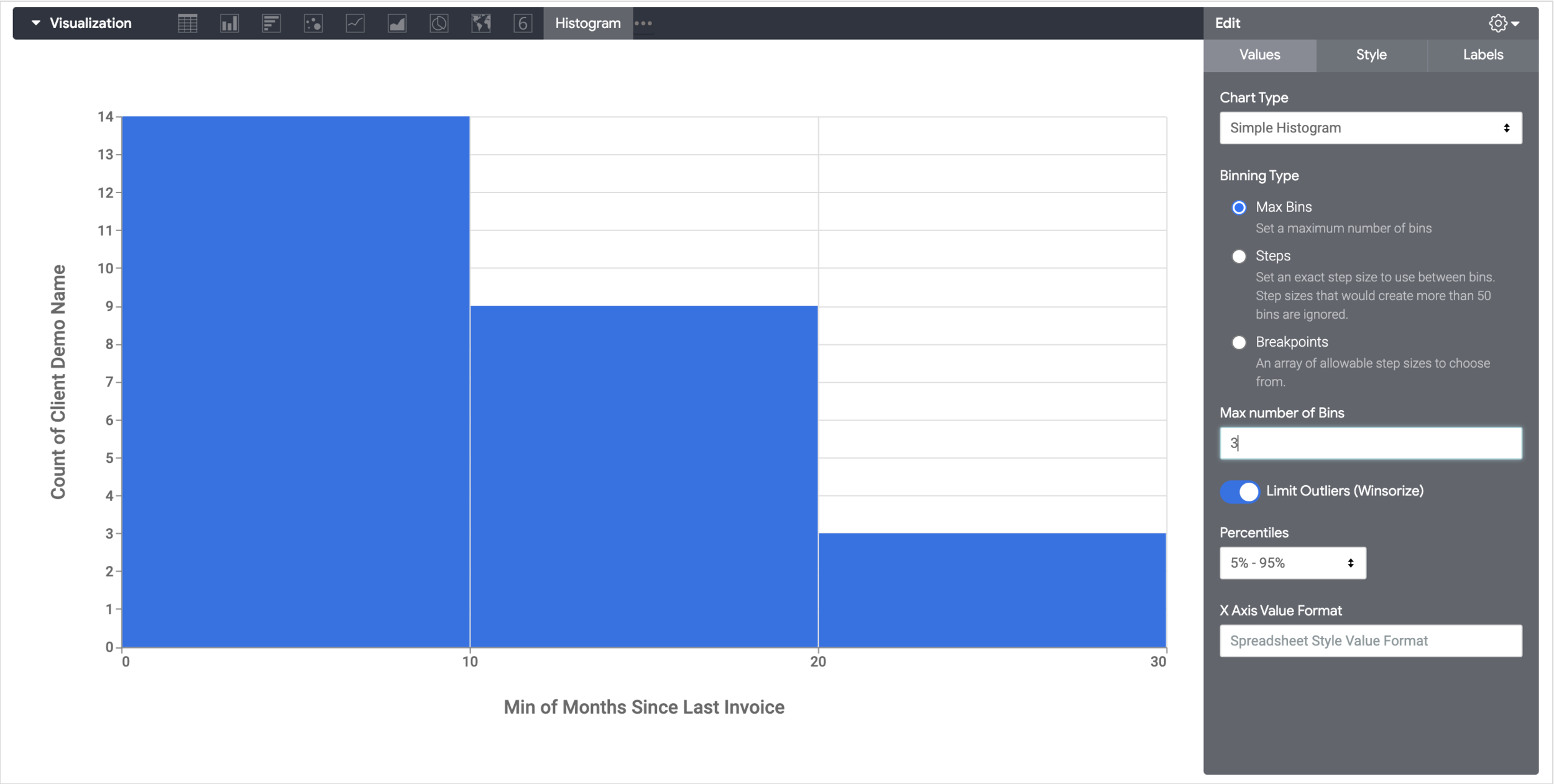
hist_1.png
Trying different options for maximum number of bucket bins, intervals between bins and set definitions for each bucket bin’s boundary we eventually settled on bin definitions that gave us a reasonably even distribution that matched customer value groupings we used elsewhere in the business.
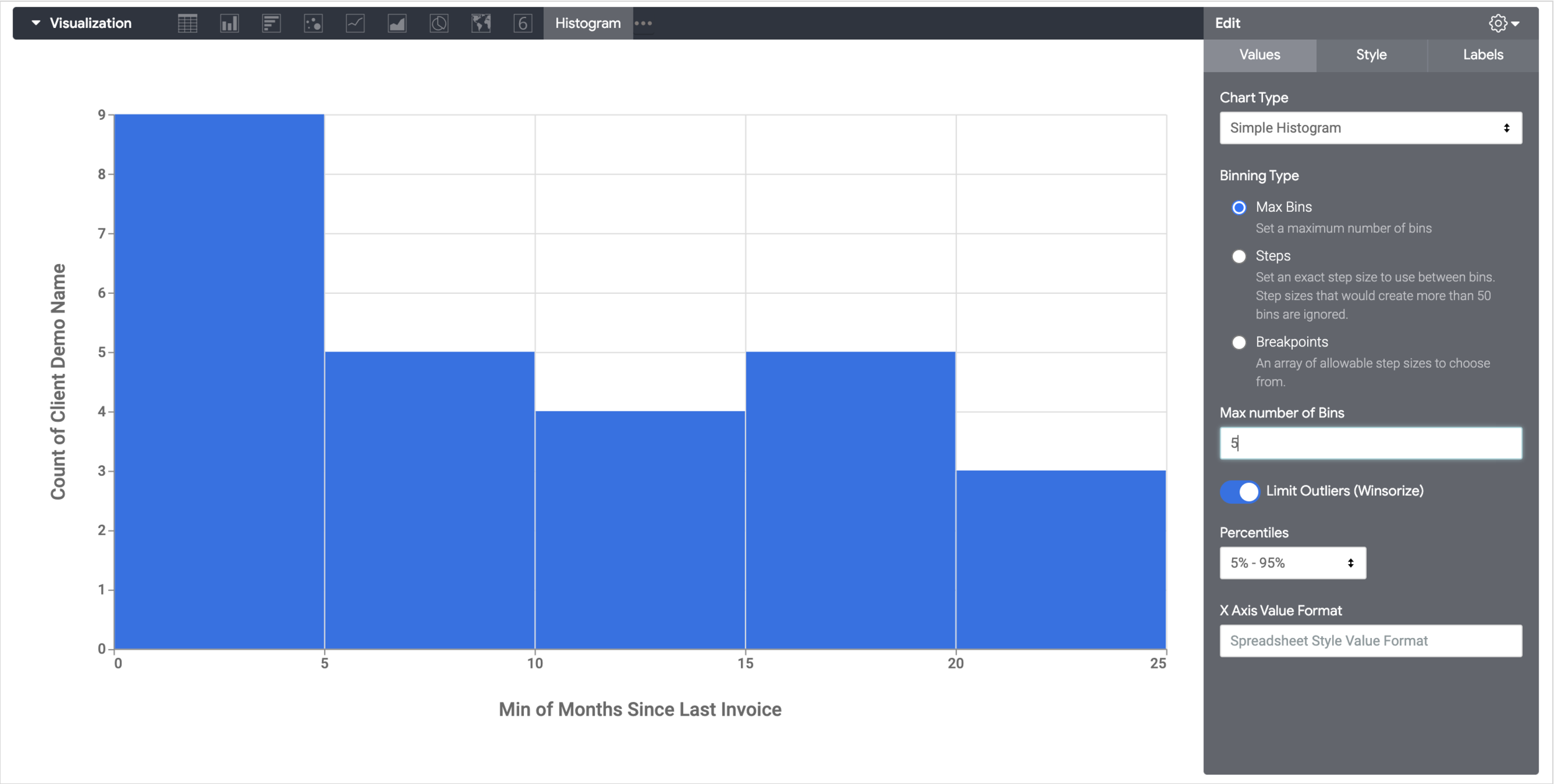
hist_2.png
Now we knew what bucket boundaries to use, those measures were then used to create a LookML Native Derived Table.
view: rfm_model {derived_table: {explore_source: companies_dim {column: total_invoice_count_in_clients_last_12m { field: projects_invoiced.total_invoice_count_in_clients_last_12m }column: total_invoice_gbp_amount_in_clients_last_12m { field: projects_invoiced.total_invoice_gbp_amount_in_clients_last_12m }column: invoice_months_recency { field: projects_invoiced.min_invoice_months_before_now }column: company_pk { field: company_deal_value_attribute.company_pk }filters: {field: projects_invoiced.invoice_gbp_revenue_amountvalue: ">0"}filters: {field: company_deal_value_attribute.company_pkvalue: "-EMPTY"}derived_column: rfm_frequency_score {sql: case when total_invoice_count_in_clients_last_12m between 0 and 1 then 1when total_invoice_count_in_clients_last_12m between 1 and 2 then 2when total_invoice_count_in_clients_last_12m between 2 and 5 then 3when total_invoice_count_in_clients_last_12m between 5 and 10 then 4when total_invoice_count_in_clients_last_12m > 10 then 5end;;}derived_column: rfm_recency_score {sql: case when invoice_months_recency between 0 and 5 then 5when invoice_months_recency between 5 and 10 then 4when invoice_months_recency between 10 and 15 then 3when invoice_months_recency between 15 and 20 then 2when invoice_months_recency > 20 then 1end;;}derived_column: rfm_monetary_value_score {sql: case when total_invoice_gbp_amount_in_clients_last_12m between 0 and 5000 then 1when total_invoice_gbp_amount_in_clients_last_12m between 5000 and 10000 then 2when total_invoice_gbp_amount_in_clients_last_12m between 10000 and 25000 then 3when total_invoice_gbp_amount_in_clients_last_12m between 25000 and 50000 then 4when total_invoice_gbp_amount_in_clients_last_12m > 50000 then 5end;;}}dimension: company_pk {hidden: yesprimary_key: yeslabel: " Companies Company Pk"}dimension: rfm_frequency_score {group_label: "RFM Model"}dimension: rfm_recency_score {group_label: "RFM Model"}dimension: rfm_monetary_value_score {group_label: "RFM Model"}
Note that we also added derived columns to the NDT for the label definition for each of these buckets and another that concatenated all three scores together to provide the RFM “cell” segment name (541, 143, 315 etc) but I’ve left these out for brevity; similarly, we added another set of derived columns to the NDT that took combinations of recency, frequency and monetary value scores and assigned them appropriate segment names, for example for the 555 RFM cell that scores highest on all three factors.
derived_column: rfm_segment {sql: case when (case when invoice_months_recency between 0 and 5 then 1when invoice_months_recency between 5 and 10 then 2when invoice_months_recency between 10 and 15 then 3when invoice_months_recency between 15 and 20 then 4when invoice_months_recency > 20 then 5end) = 5and (case when total_invoice_count_in_clients_last_12m between 0 and 1 then 1when total_invoice_count_in_clients_last_12m between 1 and 2 then 2when total_invoice_count_in_clients_last_12m between 2 and 5 then 3when total_invoice_count_in_clients_last_12m between 5 and 10 then 4when total_invoice_count_in_clients_last_12m > 10 then 5end) = 5and(case when total_invoice_gbp_amount_in_clients_last_12m between 0 and 5000 then 1when total_invoice_gbp_amount_in_clients_last_12m between 5000 and 10000 then 2when total_invoice_gbp_amount_in_clients_last_12m between 10000 and 25000 then 3when total_invoice_gbp_amount_in_clients_last_12m between 25000 and 50000 then 4when total_invoice_gbp_amount_in_clients_last_12m > 50000 then 5end) = 5 then '01: Best Clients'...end;;;}
The final step in configuring the LookML project ready for building the dashboard was to join the LookML view containing our native derived table into our main LookML model, like this:
explore: companies_dim {label: "Business Operations"view_label: " Companies"join: rfm_model {view_label: " Companies"sql_on: ${companies_dim.company_pk} = ${rfm_model.company_pk} ;;type: left_outerrelationship: one_to_one}...}
so that the customer RFM fields it now provides are available alongside all of the other fields in our Looker explore, as you can see in the screenshot below.
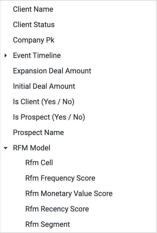
explore.png
So now that all the RFM scores and segment names have been configured in our LookML project, creating the dashboard itself is just a case of selecting the relevant explore fields and charting the resulting data using regular table and bar chart visualization types along with the Packed Bubble visualization plug-in from the Looker Marketplace.
We also used the Treemap visualization that you can manually install into your Looker instance from Looker’s Custom Visualizations v2 Github repo and configured it to use the RFM segment cell name along with the count of clients in those segments as the measure.
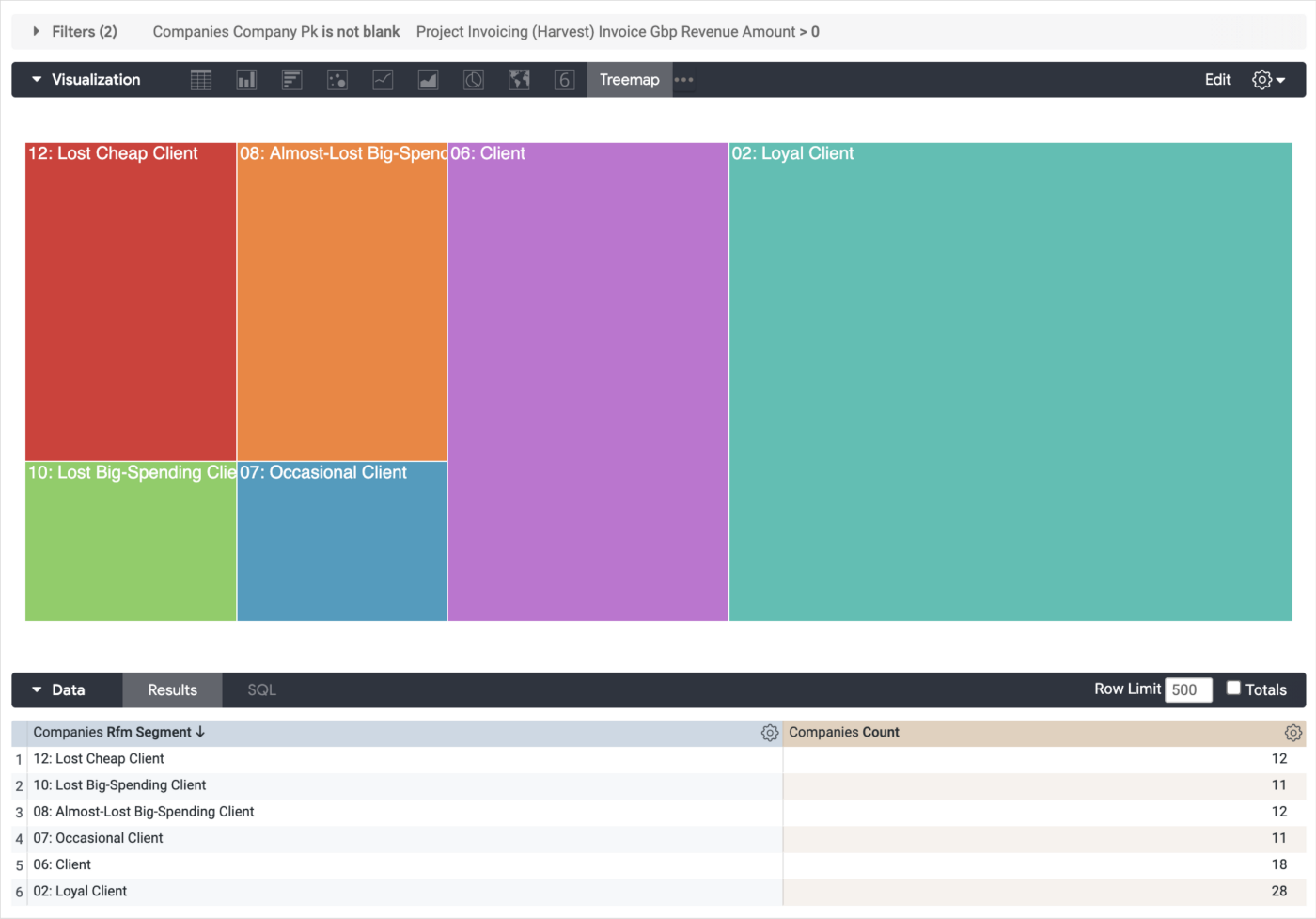
1_HInXs9zbhjGeTEF1REZDfg.png
It’s not an exact match to the RFM grid visualisation back at the start of this blog as there’s no way to specify frequency and monetary value as the visualization’s Y axis and recency as the X axis, but it does a good enough job for us in showing the ordering and relative size of each RFM cell segment.
Interested? Find out More
If the idea of creating an RFM model to segment your customer base sounds interesting to you, or you’re looking for some help and assistance building-out your new customer data analytics platform on a modern, flexible and modular data stack, contact us now to organize a 100%-free, no-obligation call — we’d love to hear from you!
Recommended Posts
One Person Many Roles: Designing a Unified Person Dimension in Google BigQuery
IQR-Based Website Event Anomaly Detection using Looker and Google BigQuery — Rittman Analytics
How Rittman Analytics uses AI-Augmented Project Delivery to Provide Value to Users, Faster
