Customer Cohorting, Retention Curves and Predictive Lifetime Value — Rittman Analytics
One of the dashboards I find most useful for understanding the direction of our business is the Customer Cohort Performance dashboard I’ve created using Looker, shown with demo numbers in the screenshot below.
Across a number of key areas for our business such as efficiency of delivery, project profitability and client retention it tells me whether the customers we manage to attract and retain now are in-fact more, or less, valuable than the ones we acquired back in the past.
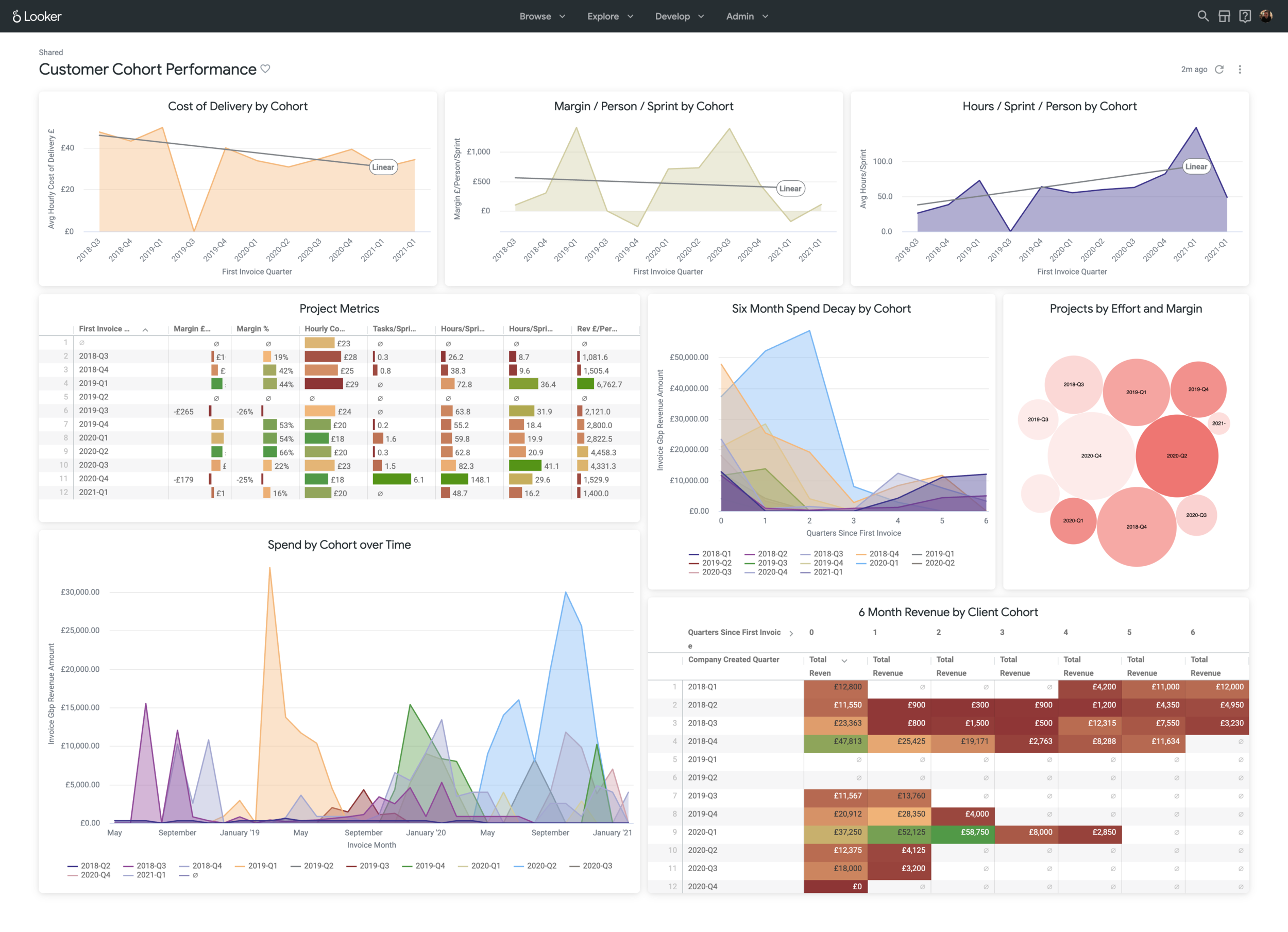
screencapture-rittman-eu-looker-dashboards-next-109-2021-02-22-01_15_39.png
Why is this information important? Because on the one hand it tells me whether our spend on marketing and sales has delivered the increase in client spend and retention it was meant to and whether the delivery team were able to service those clients’ projects in an efficient manner.
More importantly, hours to deliver and total client spend are leading and lagging indicators of how satisfied our clients are with our services, so if clients we acquire now are spending less and taking longer to service than before then there’s probably something wrong in how we’re currently running the business.
So why are dashboards and visualisations that group customers into cohorts useful, and how do they differ from your usual time-series and overall customer spend dashboards?
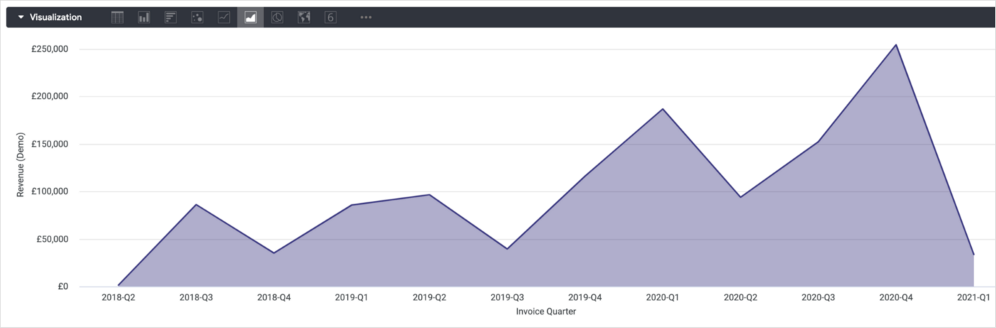
A simple time-series visualisation in Looker that shows client revenue per quarter might look something like the one in the screenshot below.
1_FdyA2vspKOApYqRNSY7kiQ.png
It’s telling me that revenue across all clients is generally increasing upwards quarter-by-quarter, but what it’s not telling me is where that revenue is coming from.
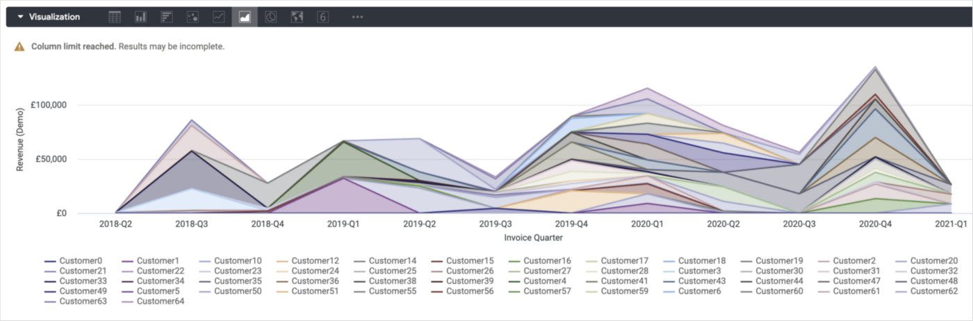
I could add client name as a pivot into this visualisation, but with over three years of trading history in our data warehouse this area chart gets pretty busy.
1_kmFLC-XEPpgK5NwQY_s3OQ.png
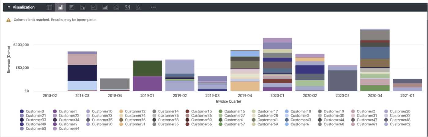
Turning the area chart into a bar chart and stacking the series makes the visualisation a bit easier to interpret than the area chart. What the visualisation is telling me now is, for each calendar quarter we’ve been in business, what proportion of the quarter’s business came from which particular customer.
1_WGIQN2KcPHe2T3cHqKHYoA.png
But what it’s not telling me though is how much business each quarter’s new intake of customers brought in, and to do that we need two additional pieces of information; when the customer’s account was created and how long after that creation date did each customer transaction take place.
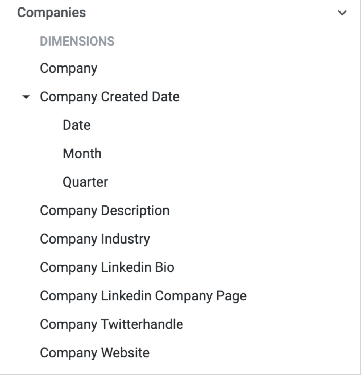
The customer’s account creation date is a field you’ll usually find alongside other customer record fields in a Looker explore and by default it’ll be an actual date, for example 01-March-2020. For cohorting purposes though you’ll want this creation date to also be available as Month and Quarter of account creation, as we’ve done in our Looker explore.
1_JtvJ70HRQkSW93d-fBMYsQ.png
To enable Month and Quarter of account creation in your explore make sure the account creation dimension in your Looker explore is configured as a dimension_group, the underlying table column has a timestamp datatype (or you CAST the column into a timestamp datatype) and you specify month and quarter timeframes for the field.
dimension_group: company_created {timeframes: [date,month,quarter]type: timesql: ${TABLE}.company_created_date ;;}
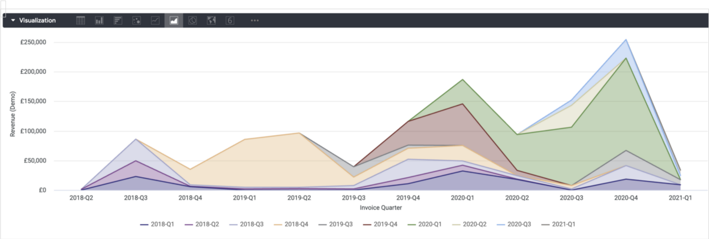
Now instead of using customer name as the pivot in our original area chart visualisation we can pivot on the account creation quarter, like this:
1_P47bVy9l59jUiq5gsnU4Lw.png
Straightaway the chart is easier to read as we’ve grouped customer accounts into these calendar quarter groupings (or “cohorts”), with each cohorts’ initial and then subsequent revenue then shown as areas in the chart that flow from the initial quarter when they were first acquired.
From the chart above we can see that the cohorts of customers we acquired in Q3–2018 and in 2019–04 have gone on to become our biggest spending and loyal customers, so we probably want to look at how we marketed and acquired customers back then to see who we were targeting and whether it’s worth repeating those campaigns..
Like many of our clients our business model is a subscription one, where clients sign-up for an initial number of delivery sprints that get their data stack built and their first couple of data sources centralised, then renew on a sprint-by-sprint basis as we add more data sources and start enabling their new data team hires.
As with any subscription business then we need to measure and understand how long we’re retaining our customers and how much they’re worth to us, and when we know both of those things then we can start to estimate the lifetime value of each of those cohorts.
To do this though we need to add a couple more pieces of information to the invoice or transactions data we hold for each of those customers, as well as the unique count of customers we have for invoices each quarter; the calendar quarter of that customers’ first invoice and the number of calendar quarters each invoice was from that first invoice’s calendar quarter, something you can do by extending the derived table definition for your invoices or transactions LookML view and using DATE_DIFF, DATE_TRUNC and the MIN() OVER analytic functions to calculate these two values for each invoice or customer transaction.
view: invoices_fact {derived_table: {sql: SELECT *,DATE_DIFF(date(invoice_sent_at_ts),MIN(date(invoice_sent_at_ts)) OVER (PARTITION BY c.company_pkRANGE BETWEEN UNBOUNDED PRECEDING AND UNBOUNDED FOLLOWING),QUARTER) AS quarters_since_first_invoice,DATE_TRUNC(MIN(DATE(invoice_sent_at_ts)) OVER (PARTITION BY c.company_pkRANGE BETWEEN UNBOUNDED PRECEDING AND UNBOUNDED FOLLOWING),QUARTER) AS first_invoice_quarterFROM invoices_fact ;;}
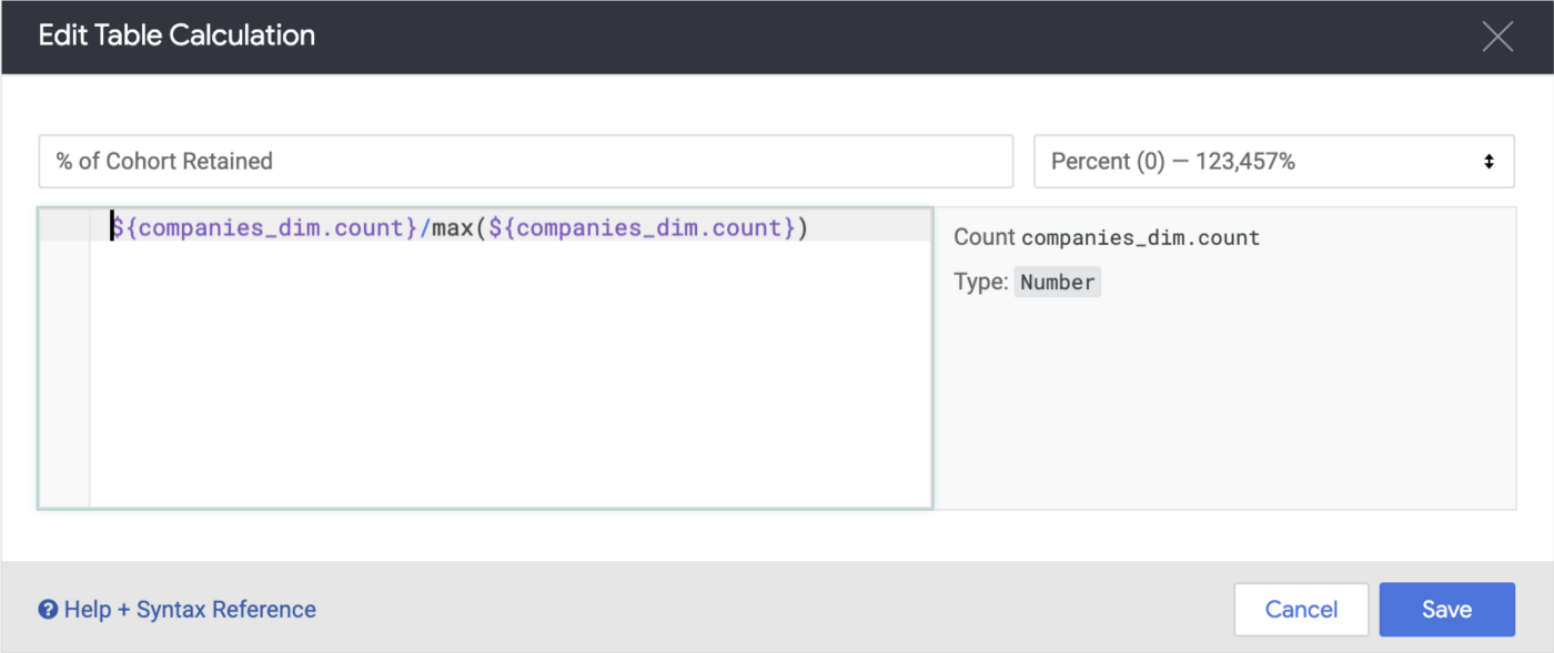
Now if I create a line chart visualization for all of our clients in aggregate, use quarters since first invoice as the X axis, count of unique customers as the measure and the following table calculation:
1_iTyi-3Sz2ck-6AqoL-4lvw.png
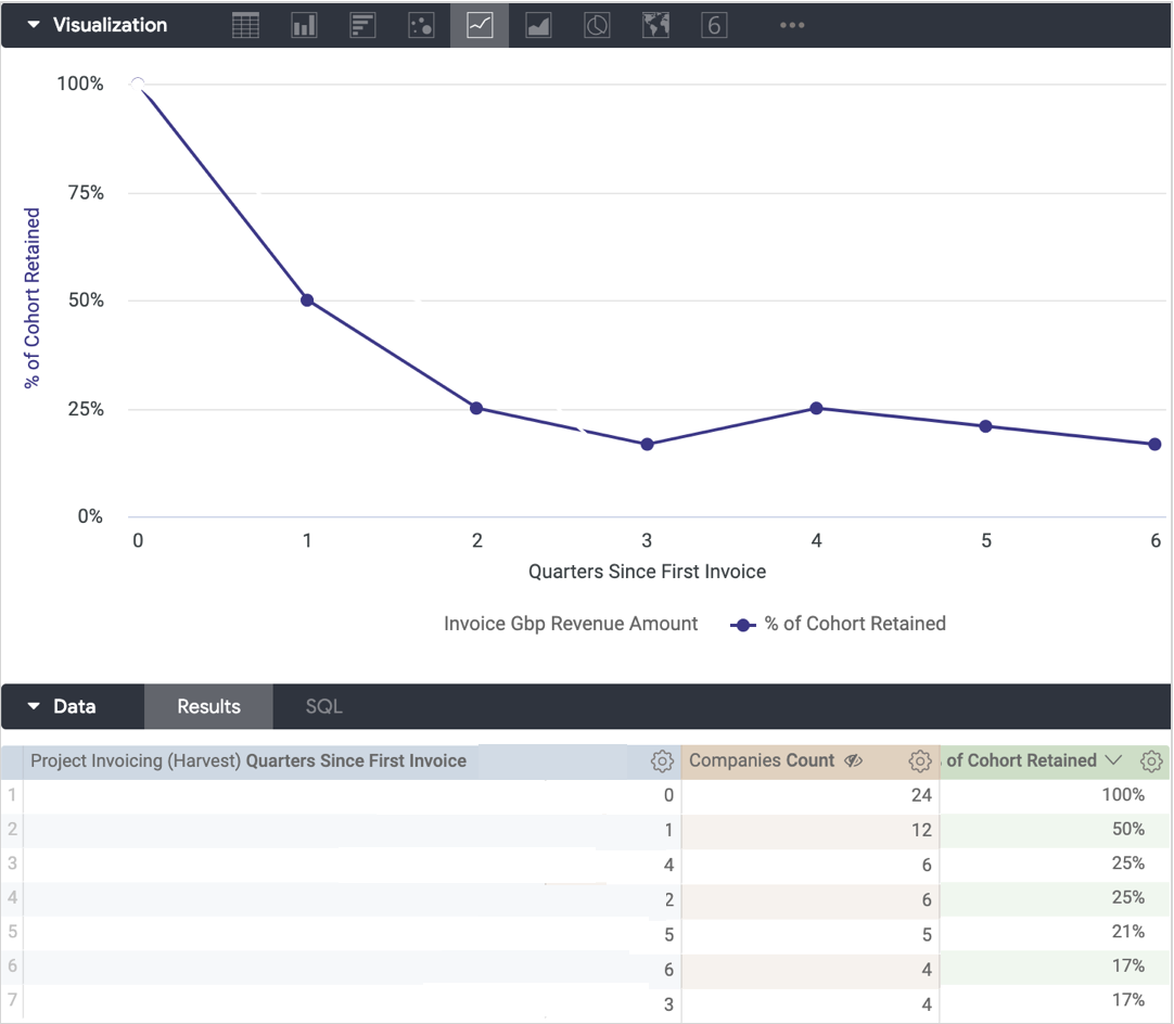
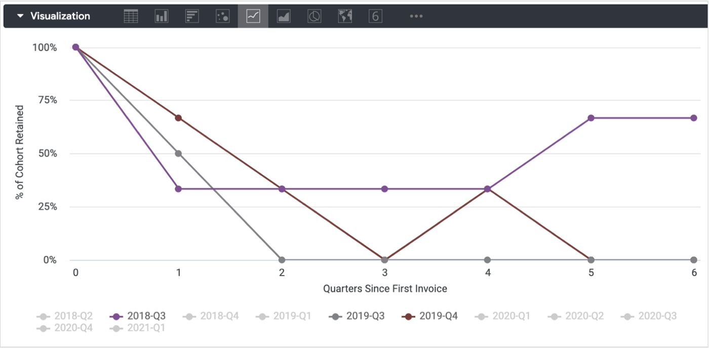
what I now have is a decay curve for clients overall, telling me that 50% of all clients churn after their first quarter, 75% churn after two but those that survive end-up being customers for life.
1_JZPrw-V-lpVfYOnlbJVo9A.png
If I add in quarter of first invoice as the customer cohort to this visualisation I can see, however, that clients we’ve acquired more recently are more likely (75%) to be retained than ones acquired when we first started out, indicating that our services now are more valuable or “sticky” over the long-term than they used to be.
1_ALt115MMvWiYSgqzfr5sMQ.png
If we assume the average active client asks us to deliver two analytics delivery sprints each month at £5k/sprint and more recent cohorts of customers stay with us for three calendar quarters rather than two, that equates to an increase in customer lifetime value of £30k (3 months x 2 sprints x £5k), something I’d want to be aware of.
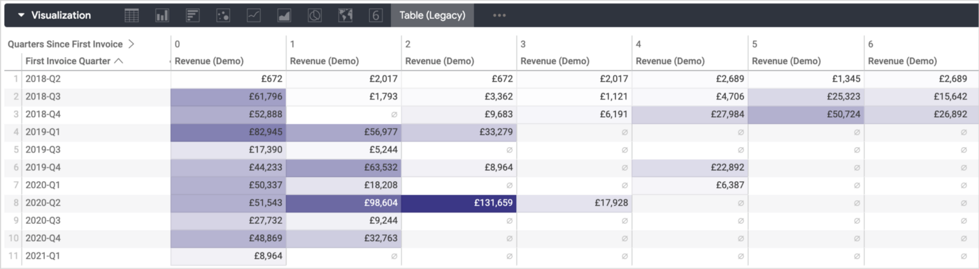
Finally though, as not all customers and cohorts result in projects of equal value, taking the quarters since first invoice quarter and pivoting it in a table (legacy) visualisation, using quarter of first invoice as the table rows and sum of revenue as the measure shows us neatly how each cohort’s revenue has fallen away, or in some cases increased, each quarter after cohort acquisition.
1_kqtcpf8wVYgZ3ZH0f2RMdQ.png
If you’re a subscription or product business looking to better understand the churn rate and value of customers you’re acquiring now compared to before and thereby the amount you can spend on acquiring more, contact us now to organise a 100% free, no-obligation 30 minute call to discuss your data needs — we’d love to hear from you.
Recommended Posts
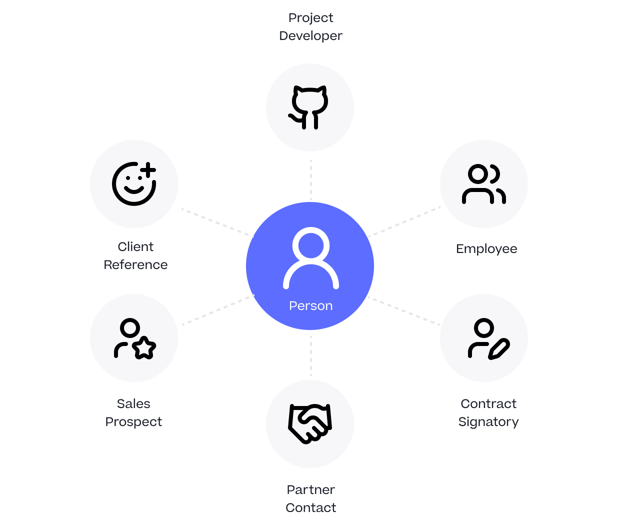
One Person Many Roles: Designing a Unified Person Dimension in Google BigQuery
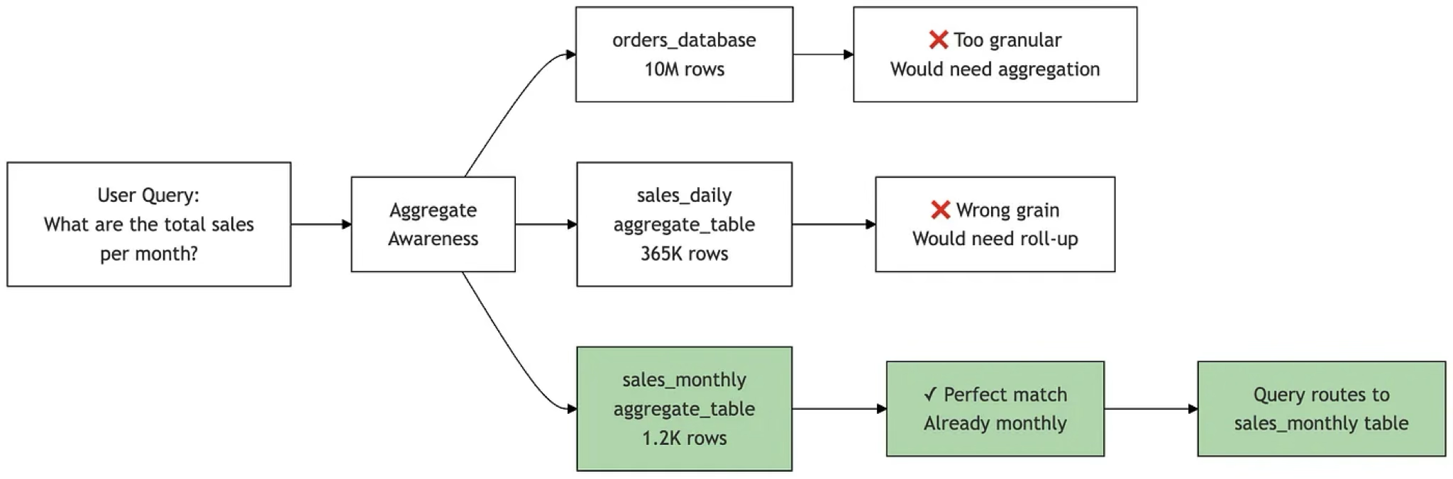
Adventures in Aggregate Awareness (and Level-Specific Measures) with Looker
IQR-Based Website Event Anomaly Detection using Looker and Google BigQuery — Rittman Analytics